consider your ad format in the design process
Before you begin jumping into the nitty-gritty details of how an ad will look, you first need to decide which ad format you will use. Facebook currently has eight main ad formats plus several other variations, each designed for different marketing goals.
Facebook ad formats include:
- Photo: This is the most basic format where you have a single image with a short header for the copy. Focus your efforts on creating a powerful visual story with your single image.
- Video: Video formats are similar to image formats, but you have a whole video to showcase your brand, product, or service.
- Stories: Stories live outside the feed and immerse viewers in a full-screen experience. Capture their undivided attention by using all the room you can to make an impression.
- Messenger: These ads are sent to your customers through Messenger. Short sentences and singular-focus images are your best bet.
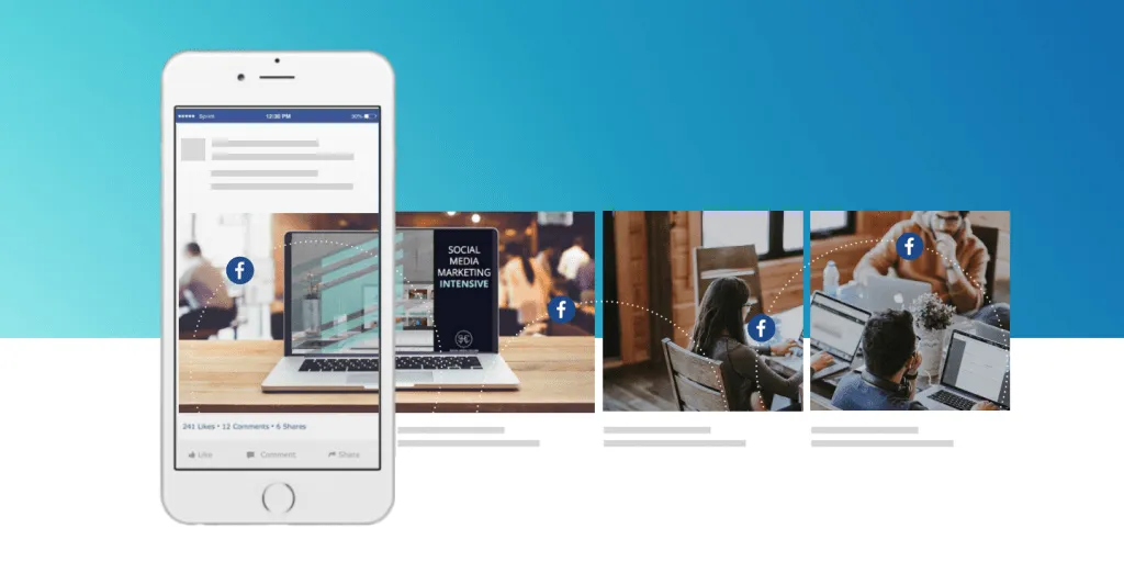
- Carousel: With a carousel, you can showcase up to 10 individual images or videos, each with its link. You can use this space to show off your new products or creatively tell a story.
- Slideshow: Slideshows are the middle ground between photo ads and video ads. They allow you to quickly put together an advertisement by combining sound with a slideshow of multiple images. Still, they require less data usage than video ads making them a better option in areas with a poor internet connection.
- Collection: You can show off your products in a virtual display case using this format. Use simple images that focus on whatever you are selling.
- Playables: These interactive ads let people play a game or use a program before downloading, which can work great in particular niches.

Before you start your design process, consider how each ad format can maximize your ads’ impact. For example, if you have a wide variety of goods to show off, carousel or collection ads could be a great fit. On the other hand, if your goal is to show how your product works, a video or story ad could allow you to do that.
ad placement should inform the design
Your Facebook ad placement can be just as important as the ad format. Ad placement determines the space you have, and designing without ad specs in mind can be disastrous.
You should know your options to choose the best ad placement for your objectives. Here’s a list of common ad placements and tips on how you can use them effectively:
- Desktop Newsfeed: Great for engagement and generating sales and leads. This format supports longer copy and link descriptions.
- Desktop Right Column: Less effective but cheaper. Images are smaller, and text is less readable. They work well for retargeting users who already know your brand. Use an image users will recognize to catch their eye.
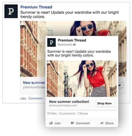
- Mobile Newsfeed: Great for engagement and discovery. However, the copy here has to be shorter, so be concise.
- Marketplace: Users are already looking for something to purchase on Marketplace, so use your ad space to showcase your product as clearly as possible. No need for too much artistic flair.
- In-Stream Video: You can have your video ad play before or during high-visibility video content, much like advertising on YouTube. This essentially gives you a custom audience.
- Stories: Facebook stories need unique, full-screen, mobile-friendly creatives. Story videos can’t be longer than 15 seconds. The good news is that more than 500 million users watch Facebook stories daily, so there is a significant upside to engaging with this kind of content.
- Audience Network: These ads are displayed outside Facebook and in partner apps. While they don’t convert quite as well as other placements, they cost much less, so they can keep your acquisition and cost-per-click low.
make your value proposition and call to action clear
According to Facebook, mobile users spend an average of 1.7 seconds browsing an individual post. So design your ad to grab attention by building your value prop into your image and keeping your CTA clear and to the point.

When designing your ads, remember that people will only give your ad a moment to impress them. Use that time effectively by putting your value prop front and center while keeping your call to action clear and easily actionable.
keep the landing page consistent with your ad
Ads are a promise to readers: click here and get this. But if your Facebook ad design and landing page design aren’t visually in sync, high bounce rates can put your ROI at risk!
When designing your ad and landing page, create them with common elements so readers can easily transition from Facebook to your website and other resources. It’s hard enough to get readers to click on your ad. Don’t let your landing page let you down when you’re so close to success.
get your image sizes right
Once you’ve started designing your ad, you need to ensure that your images or video have the correct size and aspect ratio. Poorly formatted images or videos can be distorted, grainy, or challenging to see.

